Shortly after the November 2024 election, I decided it was time to start acting like I was living in the dystopia that I am living in. We’ve managed a lot of the worst parts of cyberpunk: oppressive surveillance, multi-national corporations operating with impunity, incredible wealth disparity. Unfortunately we have failed to achieve a lot of the cool aesthetics of cyberpunk; we have all the cyber, but very little of the punk. I realized that it was on me, you, all of us to bring the punk to the table.
I decided that sovereignty over my own tech and data would be the first things I tackled. In this digital dystopia, data is everything. I can’t escape the system, but I can contribute to starving it. I can deprive it of my data, my surveillance, my behavior. The first things I looked into were services that I was getting for free or paying for online that I could move to my own locally hosted server. I landed on budgeting first. For years I’ve used You Need A Budget (YNAB), and it had served me really well; but there’s also Actual, a free open source budget program that is very similar. It was the first service that I spun up in a docker container on the mini-PC I nabbed on sale, and I started fiddling around with it.
The first thing I noticed was that it was slightly less convenient than YNAB. Don’t get me wrong, Actual is a great program, but it also falls short in some things that I liked with YNAB. But, it was worth it, right? Right?! I’m a scientist by trade, and so I plotted it. As my geometry teacher in high school taught me: if you can see the math: you can do the math. It’s trite, but it stuck with me because my mind seems to prefer analyzing things laid out visually. So I thought about a plot: convenience vs. surveillance. That led me to this diagram.
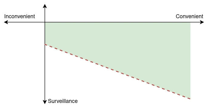
Convenience and inconvenience are a bit reductive to what I was envisioning but they stuck. They encapsulated a lot of feelings about the usefulness of a service, how much time it saved me, how much positive impact it brought to my life. As that value goes up, I’m willing to accept a bit more surveillance, to act like I can be completely invisible in a panopticon is naive at best and dangerous at worst. I can only hope that in general I’m uninteresting, but my cell is viewed just like every other. So I put a line indicating the threshold of acceptability. For me to accept surveillance, I’d need to have a certain amount of convenience. Of course there may be services that are unique, that I can’t opt out of, but they don’t belong on this chart. The shape of the plot led to what I started calling it: The Nevada Diagram.
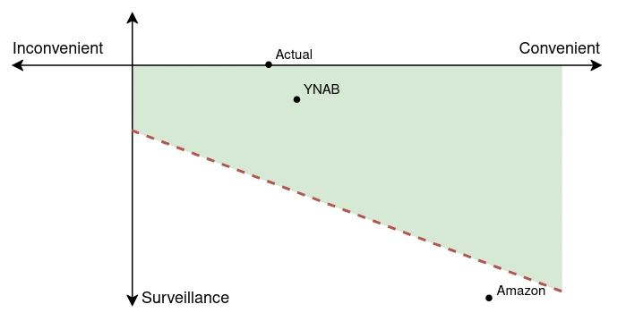
I actually figured that YNAB wasn’t so bad. They probably don’t get much from my data, but I don’t actually know. There’s a good chance that they extract much more from my use of their service than I think, it’s almost certainly false that they would extract less. I put a dot where I expected YNAB to be. Very convenient, small amount of surveillance, but overall within what I thought was acceptable. Actual was a clear improvement, only slightly less convenient, but nearly zero data being commercialized. It was an obvious improvement. I started plotting a bunch of the other things I use in my life, and even thought I wasn’t learning anything new, it made me think about the other services I was using. It made me think about just how much Amazon knew about me, and how even thought it was extremely convenient and useful, it was also fucking terrible. Terrible for my privacy, terrible for workers, terrible for the world. I decided it was out of the realm of what was acceptable. I still use it occasionally because I need to, but now I do it much more mindfully.
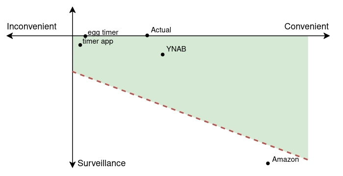
The second big change this led me to was a bit sillier. I thought about how much I use the timer on my phone. It’s such a little thing but I realized how much someone could learn about my life from my use of the timer: what am I cooking, how often am I doing a COVID test, etc. There’s a really good chance Apple is not collecting or using this data, but they could. So, I bought a digital timer for my kitchen. It was such a simple change, but I loved it. I actually ended up really enjoying the tactile feel of the device, and it made me realize that it wasn’t less convenient than my phone. In fact, without any kind of voice recognition on my phone, it was more convenient. I didn’t have to worry about grabbing my phone with messy hands, or not being able to unlock it with gloves on.
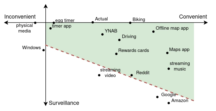
That one little change in my life kicked off a lot more things. It started to become clear to me that they combined so many functions onto a single device because it creates so many potential ways to learn about habits. To monetize our behavior if they want to. I started finding other devices to use that weren’t my phone. I booted up an old android phone and downloaded maps and music, it’s my car phone now. I started looking for a actual camera to use. I started divesting from my phone.
I think it was a good move, I feel significantly better about how I interact with tech and services and data now. So much more of my life is hosted on my own server, so much of my data is now in my possession. It adds a significant amount of responsibility, I need backups and storage and to keep track of a bunch of docker containers. But it’s fucking liberating. Sure, I can lose my data, but at least it’s now mine to lose.
My full diagram:
I’m sure you have opinions about my plotting, or where you’d put your own points. I don’t think, in the end, the point is for this to be correct but to make me actively think about it. It has succeeded, and I’m hoping it might be a useful exercise for you.
Jessica Rooster California, Jan 4, 2026